Tuesday, June 12, 2012

Photoshop Tutorial #4: Bokeh - light-painting


I was not able to be very creative this week due to a crazy work schedule...just incase you may find this post somewhat blah...

Bokeh, from the Japanese term for haze, is an image (usually in photography) composed of the aesthetic quality of out-of-focus or blurred points of light - i know this is kinda two years ago, but it still creates a simple and pleasant wallpaper...

 ...i used the colors from my logo, troublefish, for the base colors (and the image is part of my hero graphic from my portfolio site)...

...here we go!


1.       Create a new transparent document.
This becomes the bokeh brush.

a.   Using the ellipse tool, create a perfect circle
in black in the center of the document.


b.   Select the layer and open up the blending options
window (click the icon – fx – at the bottom of the
layers window – choose blending options…, or
select: Layer>Layer Styles>Blending Options…).


c.   The blending options window opens; find the
Advanced Blending
section and move the
opacity
slider to 50%.

                        i.      In the blending options window,
 select Stroke – set size to 12,
 position to Inside.

                       ii.      Click OK.


d.   Convert the layer into a smart object
(Layer>Smart Objects>Convert to Smart Object).


e.   Make it into a brush stroke (Edit>Define Brush
Preset…
)– now name it.  NOTE: Remember the
number that appears directly below the brush picture
(here it’s 222).


f.    Select the brush tool (Ctrl B) from the tools menu.

g.   Open the brushes window (Window>Brush).
 
                       i.     Select the brush created in the steps above
(either use its number or mouse over for the saved name).

                      ii.     Set spacing to around200%.

                     iii.     Select Shape Dynamics and set minimum diameter to 50%.

                     iv.     Select Scattering and set scatter to Both Axes
at 1000%, and count to 4.

                      v.     Select Transfer and set Opacity Jitter and
Flow Jitter to 50%.


 h.    Save and close.


2.   Create a new document; fill the backdrop with a dark grey
(i.e. hex# 303030). This is the canvas.
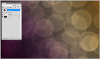


3.   Return to the canvas document and create a new layer.
Result: Layer1: grey background | Layer2: color gradient
4.   Create a diagonal color gradient across the new layer.
5.   Select the color gradient layer and change its blend mode
to overlay.


6.   Create a new layer group between the 2 layers and set
its blending mode to Color Dodge.

Result:
Layer1: grey background |Layer Group 1 |
Layer2: color gradient
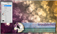

 
7.   In the group create a new layer.
 a.    Select the brush tool (Ctrl B) from the tools menu.
 b.    Select the created bokeh brush.
 c.    Set the brush size around 300.
 d.    Set the foreground color to white.
 e.    Paint first layer of bokeh.
  f.    Apply a Gaussian Blur filter of 10px to the layer.
 g.    Set the layer opacity to 60%.

8.   In the same group create a second new layer.
 a.    Select the brush tool (Ctrl B) from the tools menu.
 b.    Select the created bokeh brush.
 c.    Set the brush size around 200.
 d.    Set the foreground color to white.
 e.    Paint second layer of bokeh.
  f.    Apply a Gaussian Blur filter of 4px to the layer.
 g.    Set the layer opacity to 80%

9.   In the same group create a third new layer.
 a.    Select the brush tool (Ctrl B) from the tools menu.
 b.    Select the created bokeh brush.
 c.    Set the brush size around 100.
 d.    Set the foreground color to white.
 e.    Paint second layer of bokeh.
  f.    Apply a Gaussian Blur filter of 2px to the layer.
 g.    Set the layer opacity to 100%.

10. To enhance the backdrop, add an image or logo.

11. Save and close.


Friday, June 1, 2012

Recycled Mason Jar and Palette Planters

I caught this idea in passing on pinterest...looked easy in theory, then again practice makes perfect.
  1. add a drainage hole: with a glass/tile bit, drill a hole into the bottom of the jar - careful - the bit and jar get HOT, and may shatter under too much pressure (this takes about 30 minutes)
  2. take apart the wooden loading palette. 
  3. attach large enough hose clamps to a length of the separated palette wood with 2 screws.
  4. wrap 2 to 3 layers of electrical tape around the area of the jar to be clamped - this protects the glass from shattering as the metal flexes with the changing outside weather conditions.
  5. place jar into the clamp and tighten it.
  6. wrap a wire around the top of the jar and attach it to a screw on the back of the plank.
  7. replace the lid ring  (if your jar has one).
  8. mount wood plank in a sunny area.
  9. add river rock to the bottom of the jar to allow for water drainage - fill with potting soil.
  10. plant something... 
I made 6 thus far - 3 jars per wood plank - each growing a different herb...

Tuesday, May 22, 2012

Melted Crayon Zombie Painting - Part 1

Finally i managed to get things into perspective again and find the time to create a new painting...and not just a digital one but a one-of-a-kind canvas painting!

Well, to the left is the black and white outline of the zombie which i drew on a 4 foot tall canvas...the idea is to line up a row of "zombie"hue crayola crayons below his waist and melt them vertically  down the canvas with a hair dryer...it'll look like his color is oozing out of his body...

...stay tuned!

Wednesday, May 16, 2012

Photoshop Tutorial #3: Distressed Graphic on a Rough Surface


The easy way out when it comes to having the background show through a cover image is to use one of the layer blend modes, apply it, and walk away...this works if you want to achieve the clearly "Photoshopped" look.

...for more realism, try this (see final image below)...

...i used the graphic i created for my name site (Thomas Troisch.com) and superimposed it on a weathered wood palette backdrop - then distressed it for that aged look...

...here's how...


1.   Select a base texture – wood, paper, concrete, cardboard, etc. – make sure that it is a flat texture (see image to the right)

2.   Select a rasterized image – photo, text, graphic, logo, etc. – to weather; make sure that it has a transparent background (a PNG or PSD works best, for my image i used Thomas Troisch.com)

3.    Shift drag the image onto the base texture (this action allows the image to be centered).
  
      Result:  
      layer1: base texture, layer2: image

4.   Select the image layer (L2) and change its blend mode to multiply.
(see image to the right)

5.   Select the base texture layer (L1) and duplicate it (Ctrl J), move it above the image layer (L2).

Result: 
layer1: base texture, layer2: image, 
layer3: duplicate base texture


6.   Select the duplicate layer (L3) and desaturate it (Image>Adjustment >Desaturate – Shift Ctrl U).


7.   Select the duplicate layer (L3) and apply a levels adjustment (Image>Adjustment >Levels –Ctrl L) as follows (once done, OK):
Move the black pointer around the left base of the peak and the white around the right.
Rule: all dark texture will mask the image and all light texture will reveal it.

Result
the more dark and/or black areas in the texture results in a grungier final image.
8.   Perform a select all (Ctrl A) on the duplicate layer (L3), then copy (Ctrl C) the selection, then deselect it (Ctrl D).

9.   Hide the duplicate layer (L3) (click on the eye icon to the left of the layer name).


10. Select the image layer (L2) and create a layer mask (click the icon – white circle in a grey rectangle – at the bottom of the layers window, or select: Layer>Layer Mask>Form Transparency).

11. Alt + Click into the layer mask in the image layer (L2) and paste (Ctrl V) the black & white texture into it.


12. Click on the eye icon next to the layer name on the image layer (L2) to view the final result.

Wednesday, May 9, 2012

Titled Window Ledge/Sill Plate

The originals (those that came with the house), wood composite all wrapped-up in their fading 70s glitter pergo-laminant glamor, didn't quite cut it for me...
...these glass tiles (0.75 inch squares available by the square foot) applied themselves very well to the dimensions of the underlying structure with mortar and grout.

The colors tie in with the overall room themes (kitchen, living-room, office, bed-room), either as complimentary or analogous hues...

...a fairly inexpensive and simple way to create some dramatically unique balance in any room...

FYI: for those suffering from Chromatophobia (fear of colors)...this could look pretty cool with pearl or silver tiles in a snow white room...


Tuesday, May 1, 2012

Screen Series: #4 Bill Irwin (actor and clown)

I'm still waiting on the signed print...

Bill is the fourth one in my signature series.  

Just a bit on Bill; he's an accomplished actor of stage and screen, with a professional clowning degree...outside of his theater accomplishments, he's currently best known as Mr. Noodle on Sesame Street and the "Dick & Jane" serial killer, Nate Haskell, of CSI...

Monday, April 23, 2012

Photoshop Tutorial #2: Polaroid Photography

Want to turn any of your digital images into a Polaroid picture with that unmistakable look from days-gone-by?
Well, here we go...

From this...                                                                                ...to this!


  • Create a new Photoshop document sized to a standard Polaroid picture (including frame)
     – standard ratio of a series 600 is 3½ x 4¼ inch.
  • Create a new layer and draw a perfect square
     – make sure to leave an equal gap around the top, left and right.
  • Rasterize the square.
  • Open a JPG version of the image from Photoshop Tutorial #1: Vintage Photography
    – import the image into a new layer.
  • Right click the image layer and select “Create Clipping Mask” – clipping it with the layer below.
  • Create a new layer above the image and fill it with RGB: 50/50/50
    – right click the layer and select “Create Clipping Mask”.
  • Create a vignette – make a selection area about the size of the clipping mask square – in the top menu choose “Select>Modify>Feather…” enter a value for some nicely rounded corners (if the image size is 3½ by 4¼ inch @ 150dpi, enter a value of 25 – use this as a base and ratio up according to the image size)
    – set to “Multiply” at about 80% opacity.
  • Download a nice high resolution old paper texture (something with some scarring and staining).
TIP: It is good practice to begin your own texture library with textures from stock or ones you created using your own photography – to recall as needed for future Photoshop work.
  •  Import the texture into a new layer above the vignette
    – right click the layer and select “Create Clipping Mask”, set to “Multiply” at about 70% opacity.
  • Create a new layer and fill it with RGB: 210/210/210.
  • To build the Polaroid frame
    – make a selection area the size of the image square and click the “Add Vector Mask” button in the layers window to create a layer mask to reveal the photograph under it.
  • Add a “Bevel and Emboss” effect to give the frame some depth
    – Upward Inner Bevel, Smooth with a global light source @ 120
    ° and 30°.
  • Create a new layer and fill it with RGB: 210/210/210.
  • Add a noise filter: “Filter>Noise>Add Noise…” – Gaussian blur 3% NOT monochromatic.
    – right click the layer and select “Create Clipping Mask”.
  • Create an new layer for the Polaroid type – Dot Matrix Regular is a good match
    – type out the 15 number code (left) and “Polaroid” (right) at the bottom of the image.
    – right click the layer and “Rasterize Type” and select “Create Clipping Mask”.
  • Import an old paper texture into a new layer above the text layer
    – right click the layer and select “Create Clipping Mask”, set to “Multiply” at about 70% opacity.